
 Lately I’ve been really into yoga. For those who don’t know, yoga is a gateway activity that can lead to all sorts of far-out hippie beliefs and bizarre holistic health practices, many of which I find myself exploring with an eagerness to become more deeply enlightened.
When I put it out to the universe that I would transform my modest freelance writing practice into a thriving, well-established communication services company, I knew I wanted my brand to clearly reflect my value proposition and values as an individual.
Energized imagery
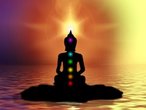
Every hardcore yogi is aware of the seven chakras, which are defined by The Chopra Center as swirling wheels of energy that correspond to massive nerve centres in the body.
“Each of the seven main chakras contains bundles of nerves and major organs, as well as our psychological, emotional, and spiritual states of being,” the Center explains.
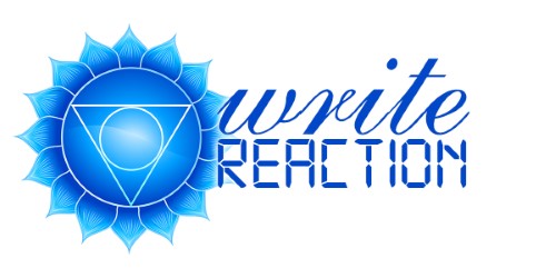
 The blue symbol on the left side of my logo is representative of the fifth chakra, Vishuddha, aka throat chakra.
“To be open and aligned in the fifth chakra is to speak, listen, and express yourself from a higher form of communication,” according to The Chopra Center gurus.
‘Nuff said, as far as I was concerned!
Storytelling with fonts
![]() Fonts also played a large role in the telling of my brand story. The word write is displayed in cursive, which is meant to be symbolic of traditional media, including newspapers, magazines, newsletters, and other forms of print publications. As a J-school grad of Humber’s class of ‘05, my primary focus was magazine writing and editing. I even began my writing career as a freelance trade magazine journalist whose work graced the pages of publications like Canadian Plastics and HazMat Management (thrilling, indeed!).
Fonts also played a large role in the telling of my brand story. The word write is displayed in cursive, which is meant to be symbolic of traditional media, including newspapers, magazines, newsletters, and other forms of print publications. As a J-school grad of Humber’s class of ‘05, my primary focus was magazine writing and editing. I even began my writing career as a freelance trade magazine journalist whose work graced the pages of publications like Canadian Plastics and HazMat Management (thrilling, indeed!).
![]() A year later, I was hired as the communications specialist for a large corporation and learned digital content writing on the job and through a number of professional development courses, hence the font of the word reaction.
A year later, I was hired as the communications specialist for a large corporation and learned digital content writing on the job and through a number of professional development courses, hence the font of the word reaction.
Holistic awareness
The use of these fonts, together with the throat chakra, is intended to illustrate my holistic understanding of effective traditional and digital communications. And just in case the visual doesn’t hit home with some folks, the tagline, Evoking emotion and influencing action through clear, clever content, should leave no doubt of the brand identity I strive to uphold.
So… was understanding my brand as simple as holding dancer’s pose for 30 seconds with your eyes closed? 🙂 You tell me!
Until next time, Namaste.


Comments are closed.